Building Design System for Amazon Nova
“Inheriting a fragmented product landscape, I designed and deployed a comprehensive system that synchronizes brand expression with technical performance. I built the modular toolkits, motion standards, and accessibility tokens that ensure every interaction across the Nova ecosystem speaks with a single, trustworthy voice.”
Context
Key Objectives
Establish Engineering Parity: Bridge the disconnect between design and development by creating a tokenized system where Figma components map 1:1 to React code.
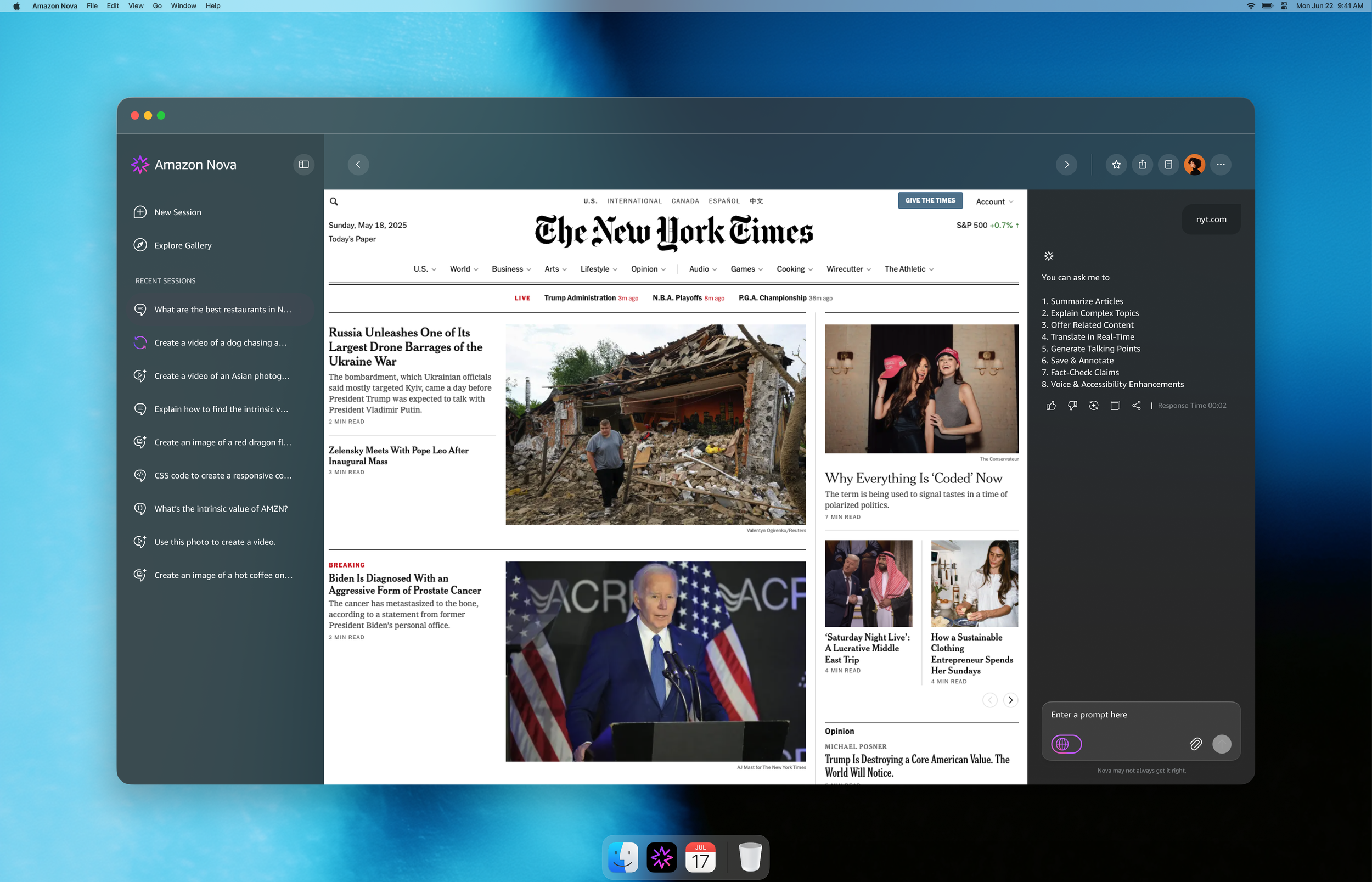
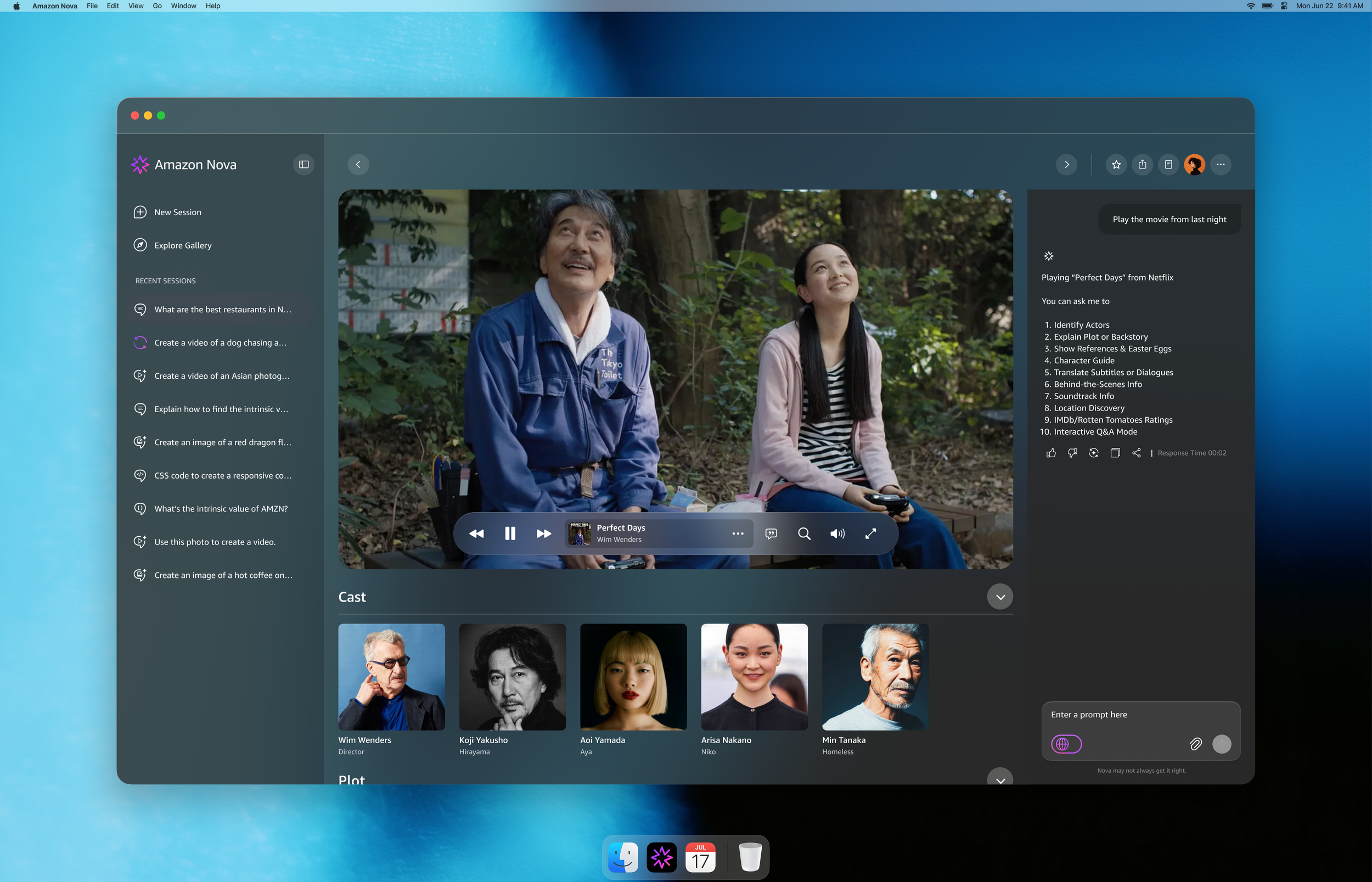
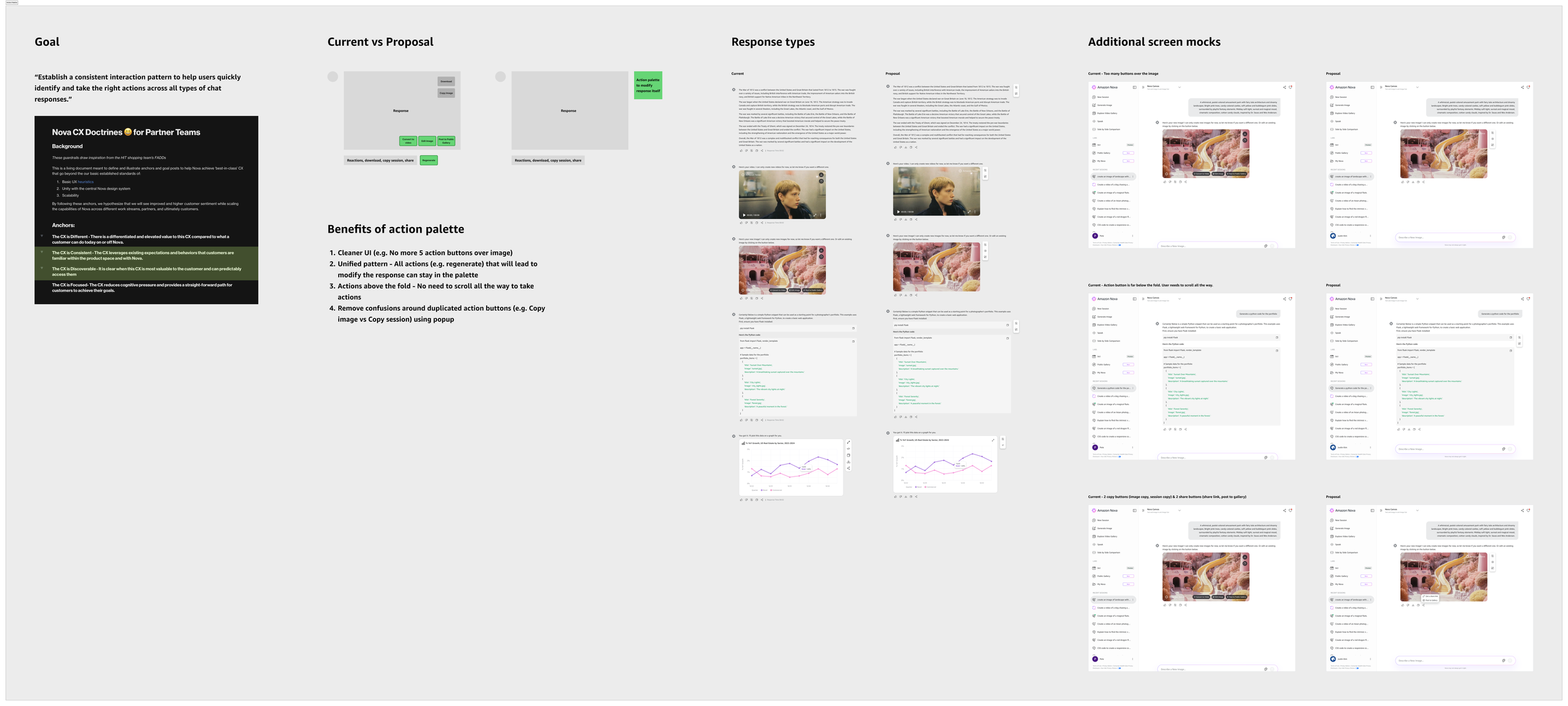
Unify Multimodal Interactions: Define a consistent "Action Language" that allows users to interact seamlessly with diverse AI outputs—whether the model is generating a video, writing a script, or analyzing a chart.
Accelerate Delivery Velocity: Reduce the "Time-to-Ship" for feature teams by providing a pre-validated library of accessible, responsive components.
Challenge
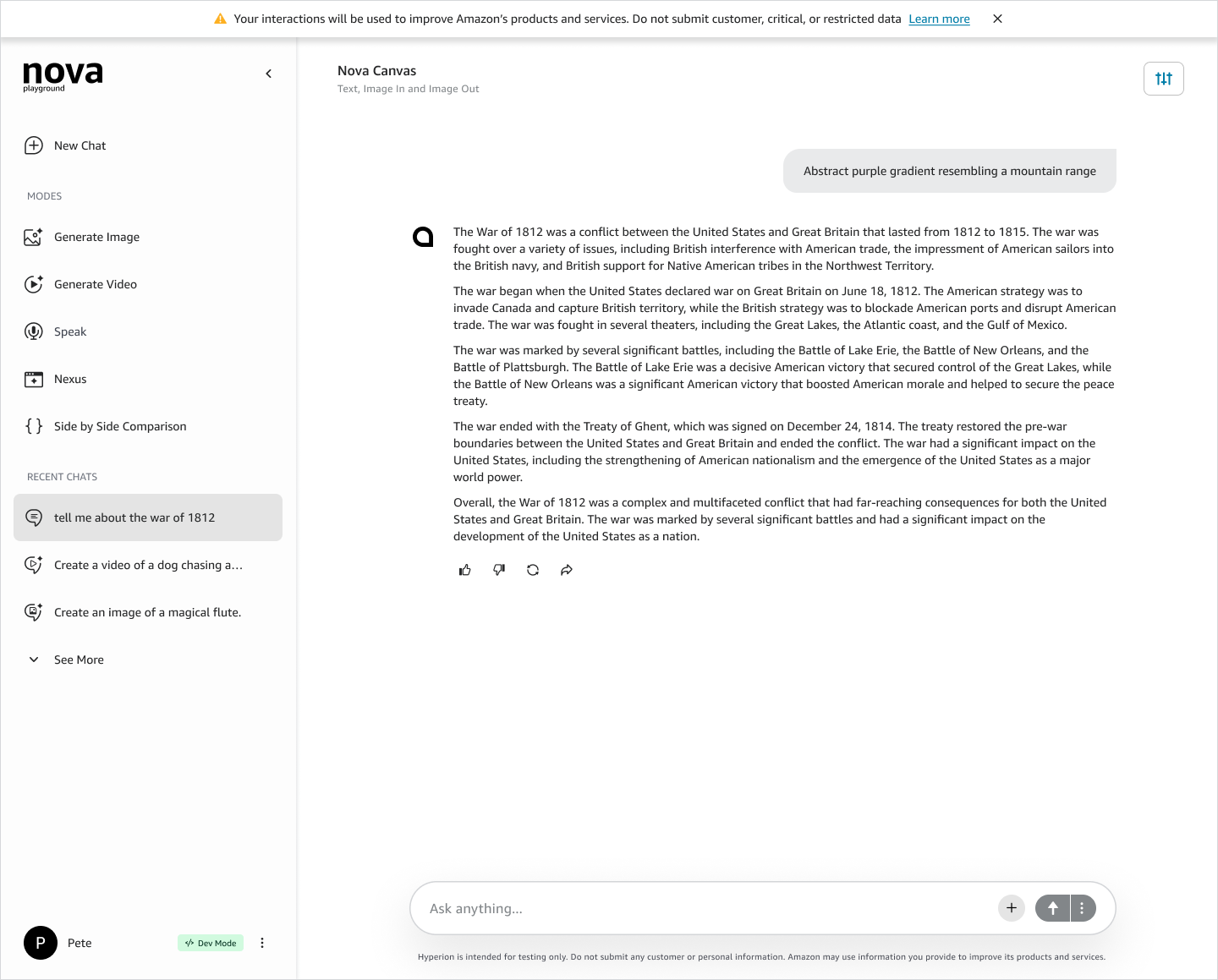
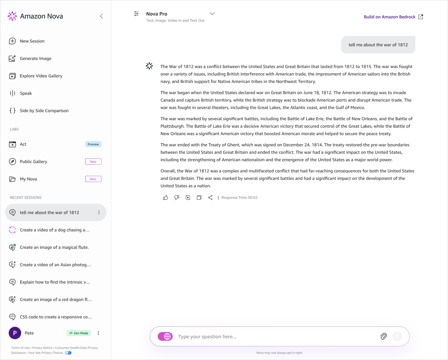
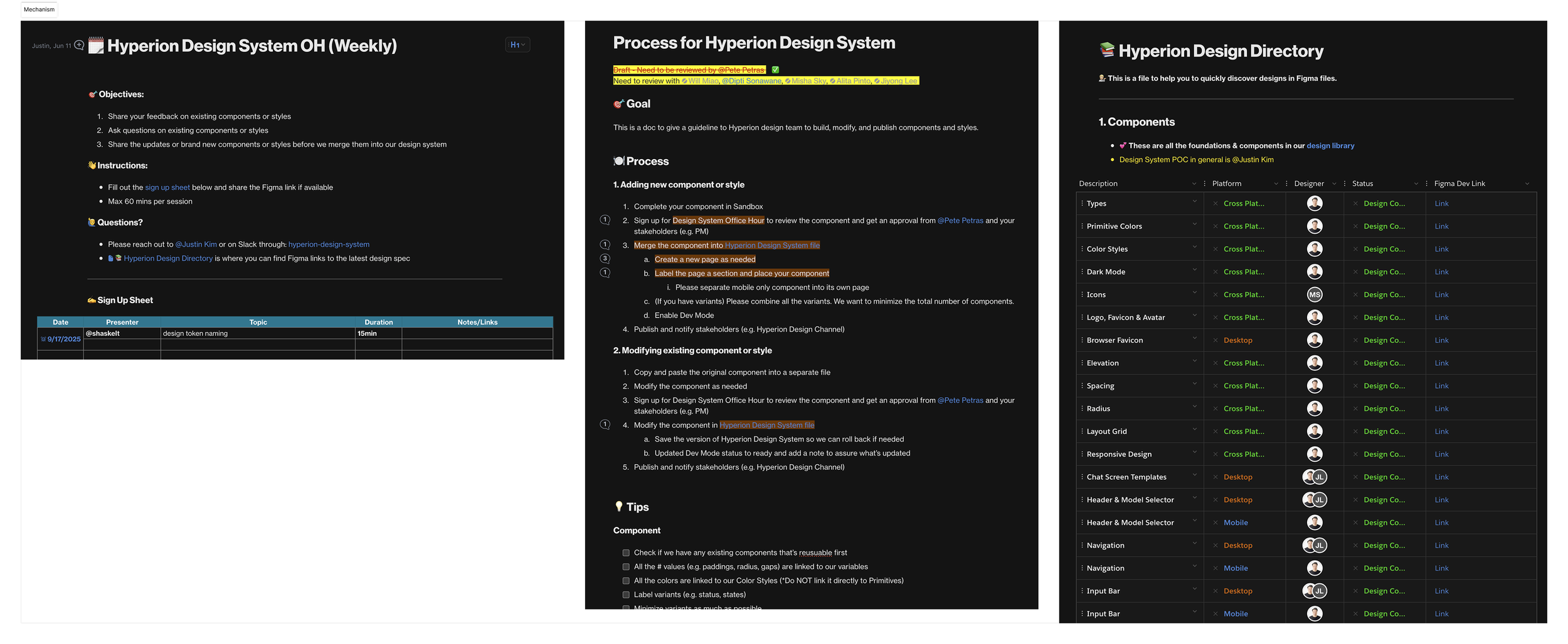
After a fast beta, Nova was expanding into multimodal output — text, video, code generation — with no shared foundation underneath. We were shipping features faster than we could standardize them, and design intent and production code were drifting apart with every release.


Roles & Responsibilities
Role: Sr. UX Designer, Amazon Nova · Design system owner
Scope: End-to-End Architecture, Documentation, and Governance
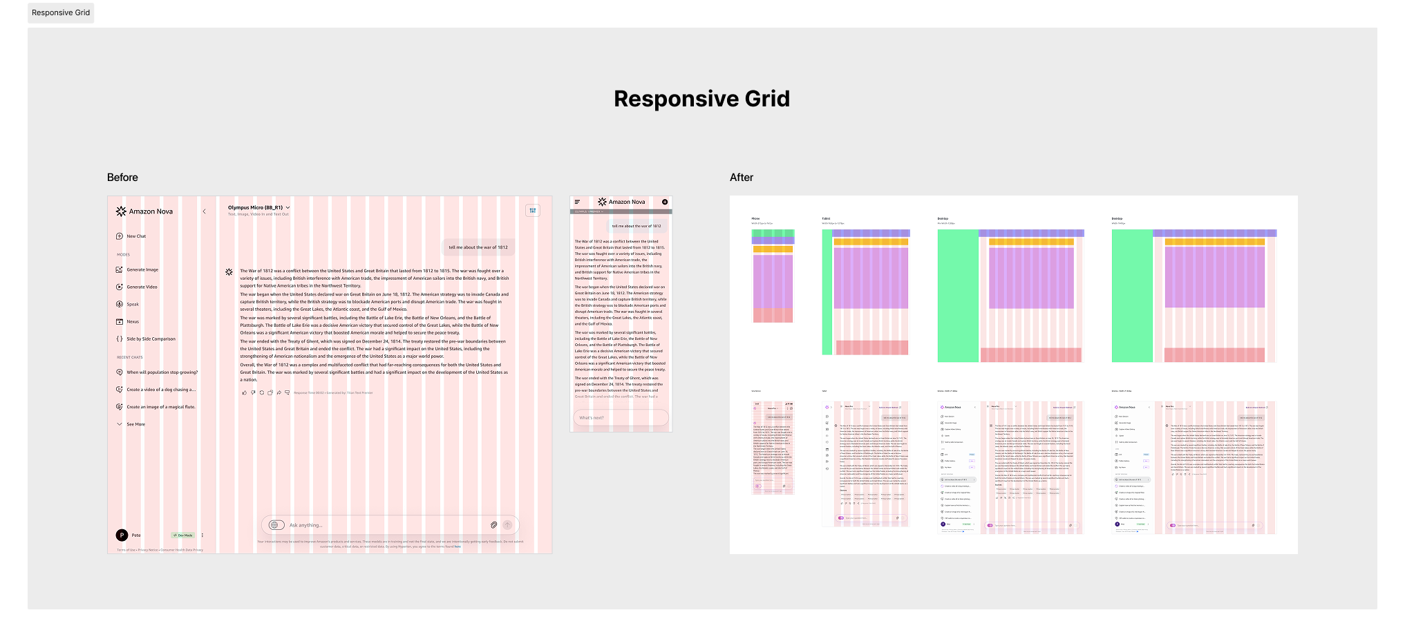
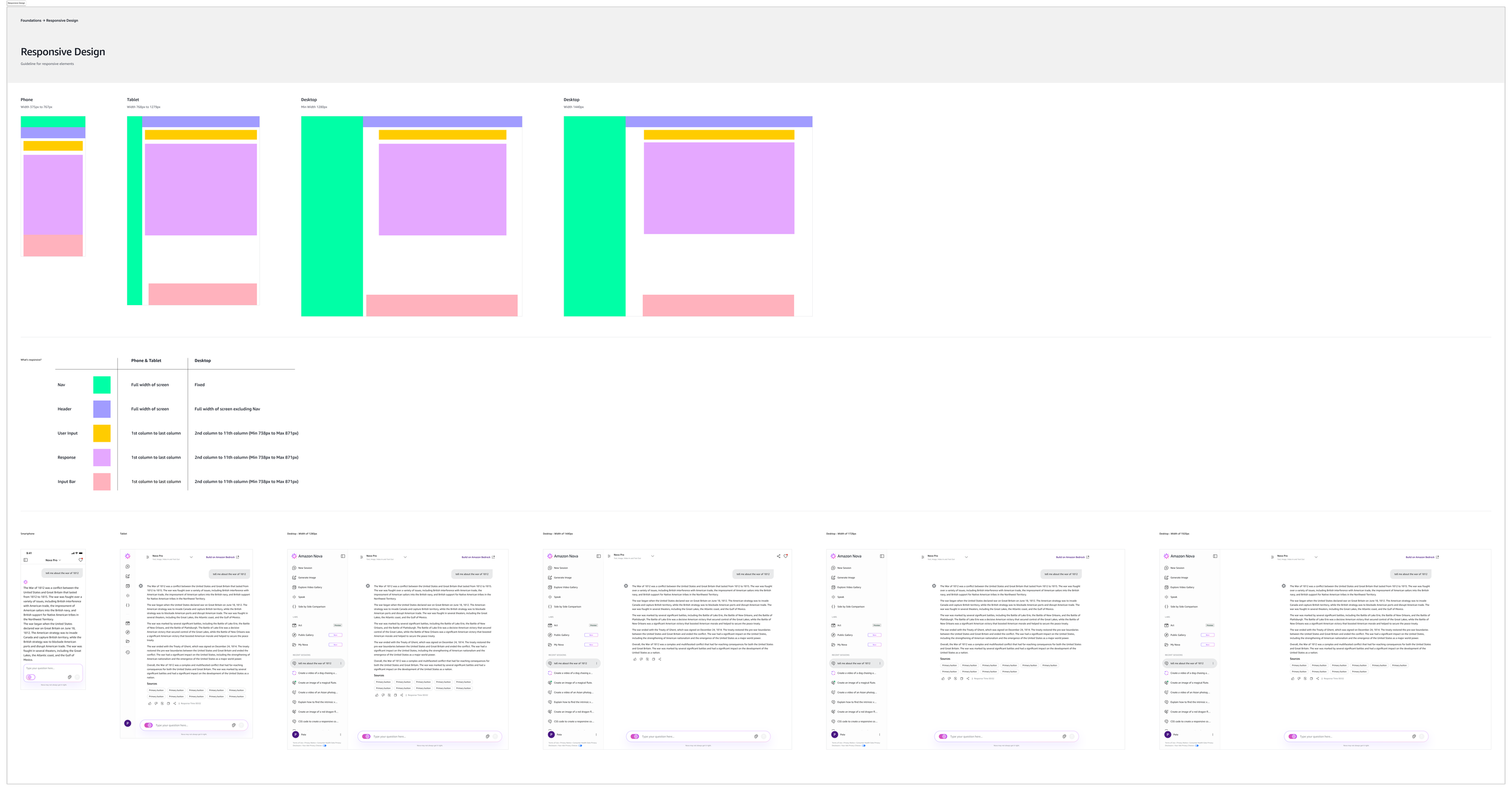
System Architecture: I defined the multi-tier token taxonomy (Global vs. Semantic) to manage color, typography, and motion across light/dark modes.
Component Engineering: I built and maintained the core Figma library, ensuring all assets met WCAG 2.1 accessibility standards before handoff.
Governance & Adoption: I established the "Contribution Model" and held weekly office hours to onboard feature teams, ensuring the system evolved with product needs rather than becoming a bottleneck.
Cross-Functional Collaboration
Core Systems Squad: Me and 2 Frontend Engineering Leads.
Federated Design Partners: Three product designers across the Chat, Video and Canvas squads, who pressure-tested components against real work. I mentored one junior designer and one intern through their first system contributions.
Decisions
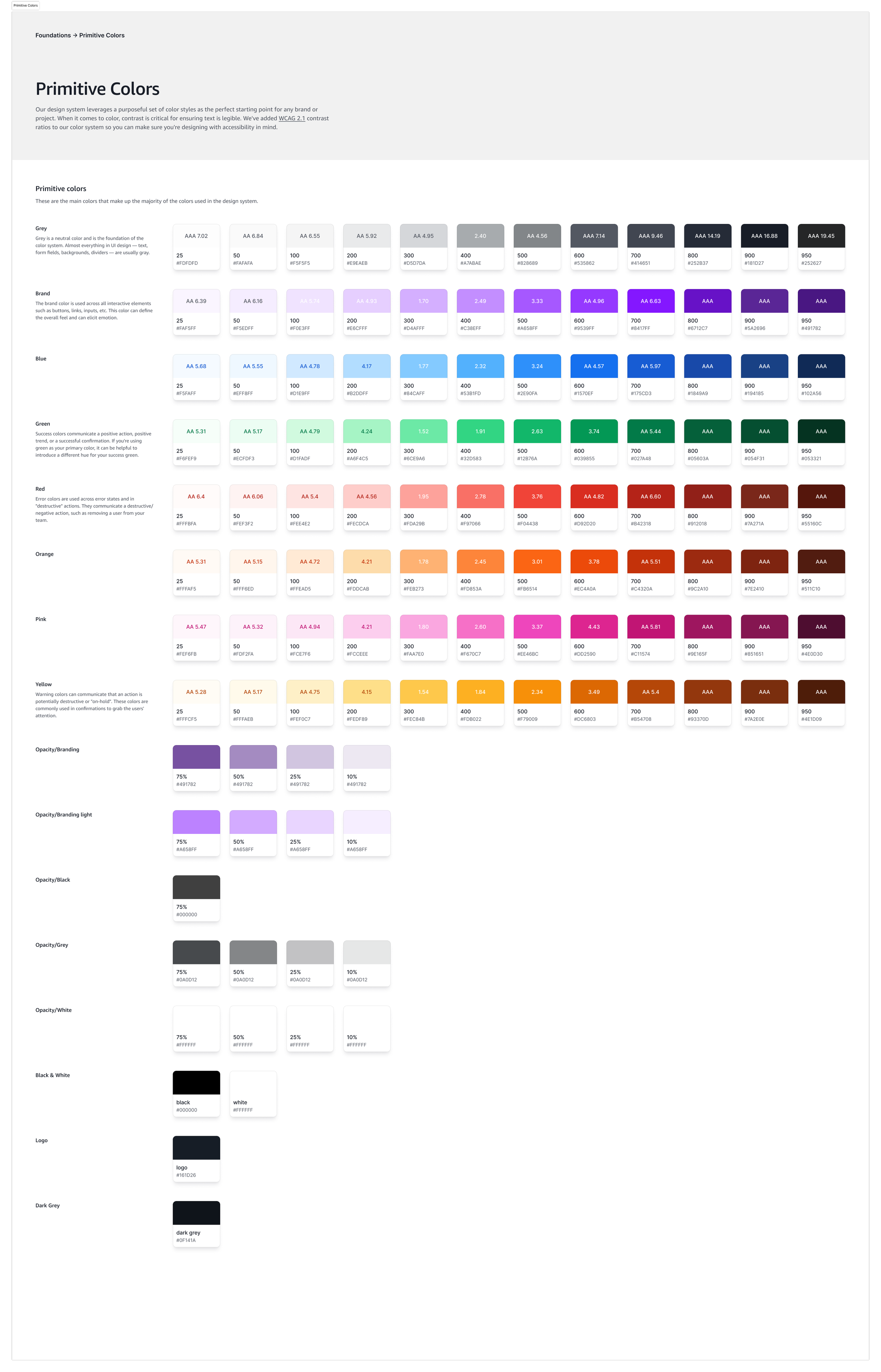
Decision 1 - Three tiers, so a brand change isn't a redesign.
Global primitives → semantic roles → component tokens. Colour, spacing, elevation and motion all resolve through the same chain. Changing the primary hue means changing one value at the top, not auditing every screen. Dark mode is carried at the semantic layer only, so it inherits everywhere below without a second set of definitions.
Decision 2 — Figma variables map 1:1 to CSS and JSON.
This is the decision that removed redlining. When a designer changes a token, the engineer reads the same name in the codebase. There is no spec document in between to fall out of date.
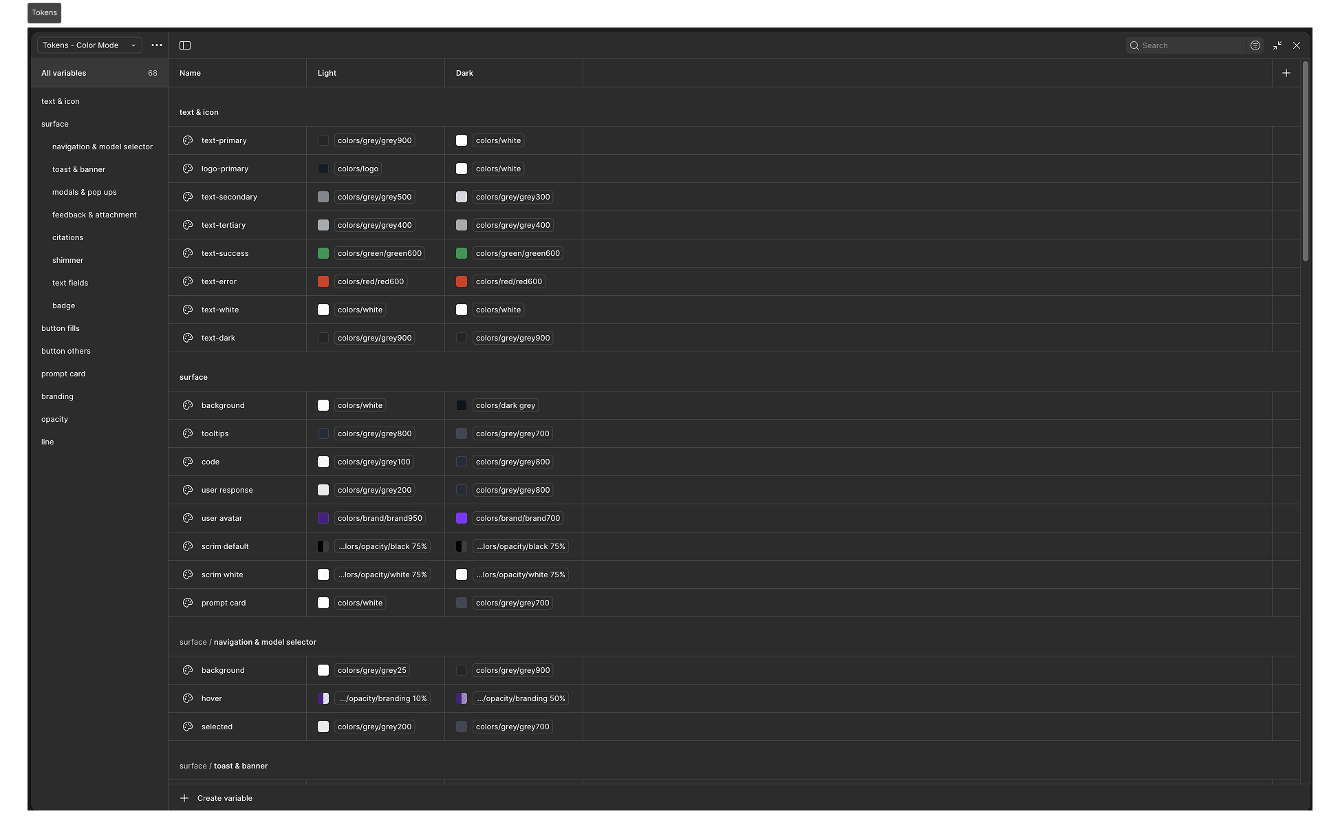
Decision 3 — Accessibility lives in the tokens, not in a review.
WCAG 2.1 AA contrast ratios and touch-target minimums are encoded in the token values themselves. A team with no accessibility background ships accessible defaults because the alternative isn't available to them. This was worth more than any audit I could have run at the end.
Decision 4 — One interaction model across output types.
Whether the model returns a video, a code block, or a chart, sharing, editing and exporting work the same way. Teams add a new response type into a container that already behaves correctly rather than inventing behaviour for it.
Decision 5 — Governance, not gatekeeping.
I wrote contribution guidelines and held weekly office hours instead of reviewing every change myself. Feature teams proposed patterns; I kept the architecture coherent. A system with one reviewer becomes a queue, and a queue gets routed around.
Scaling Adoption
A design system is only as valuable as its adoption. I moved beyond a "gatekeeper" model to establish a Federated Contribution Strategy that treated feature teams as co-authors of the system.
System Office Hours: I hosted weekly technical workshops to troubleshoot implementation challenges and review edge cases with product squads. This created a continuous feedback loop, allowing me to identify architectural gaps before they became technical debt.
Democratized Evolution: I defined clear "Contribution Guidelines" that empowered designers to build and propose their own patterns. This decentralized approach removed the bottleneck of a single systems team and accelerated the system’s coverage of complex, real-world use cases.
Visual & Interaction Enhancements
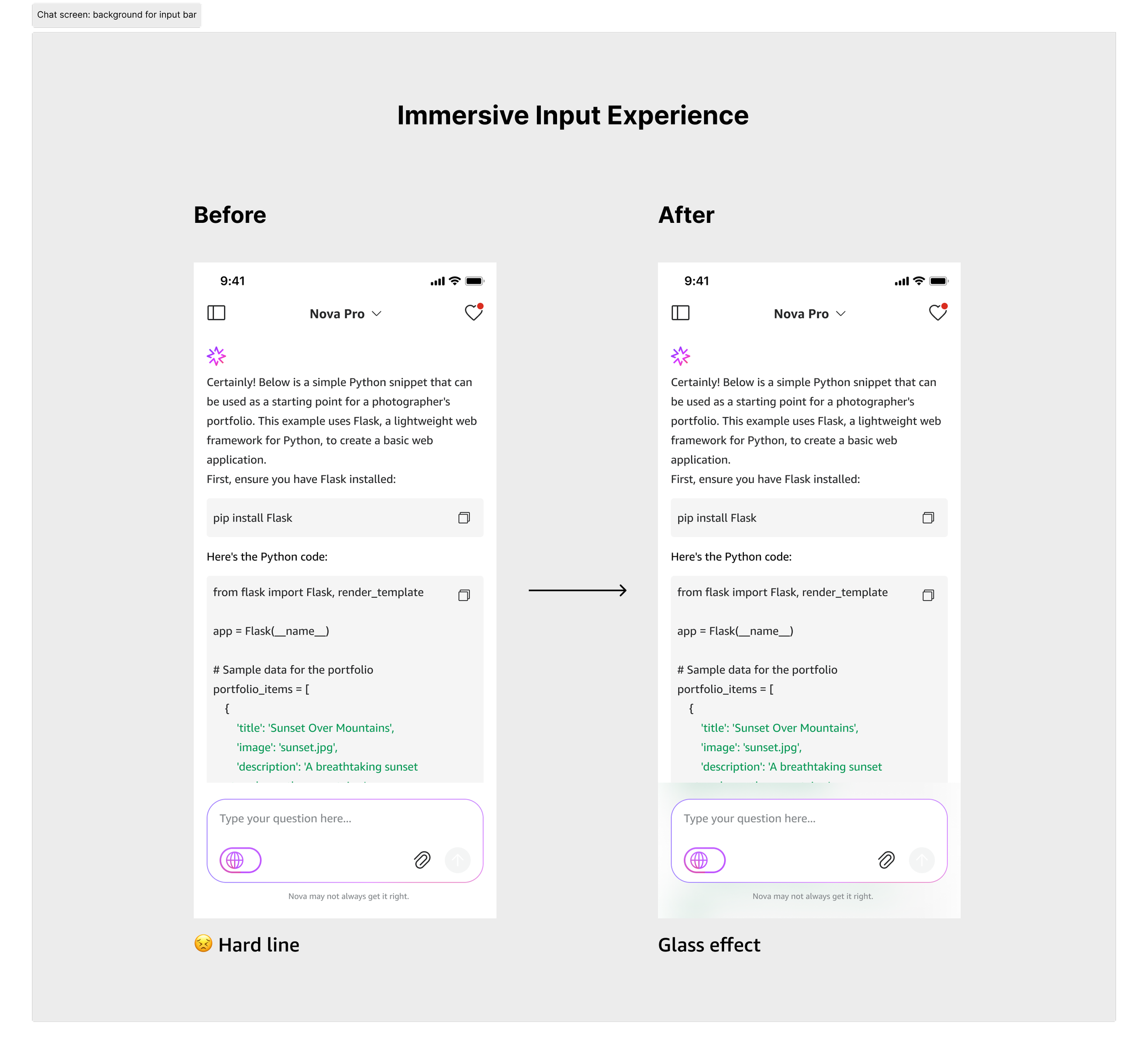
Immersive Input Experience
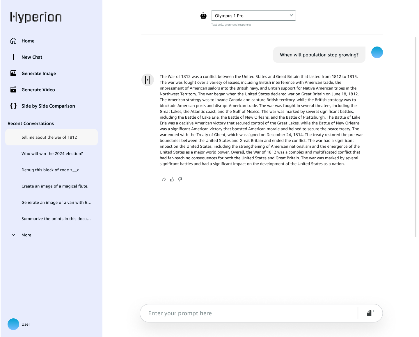
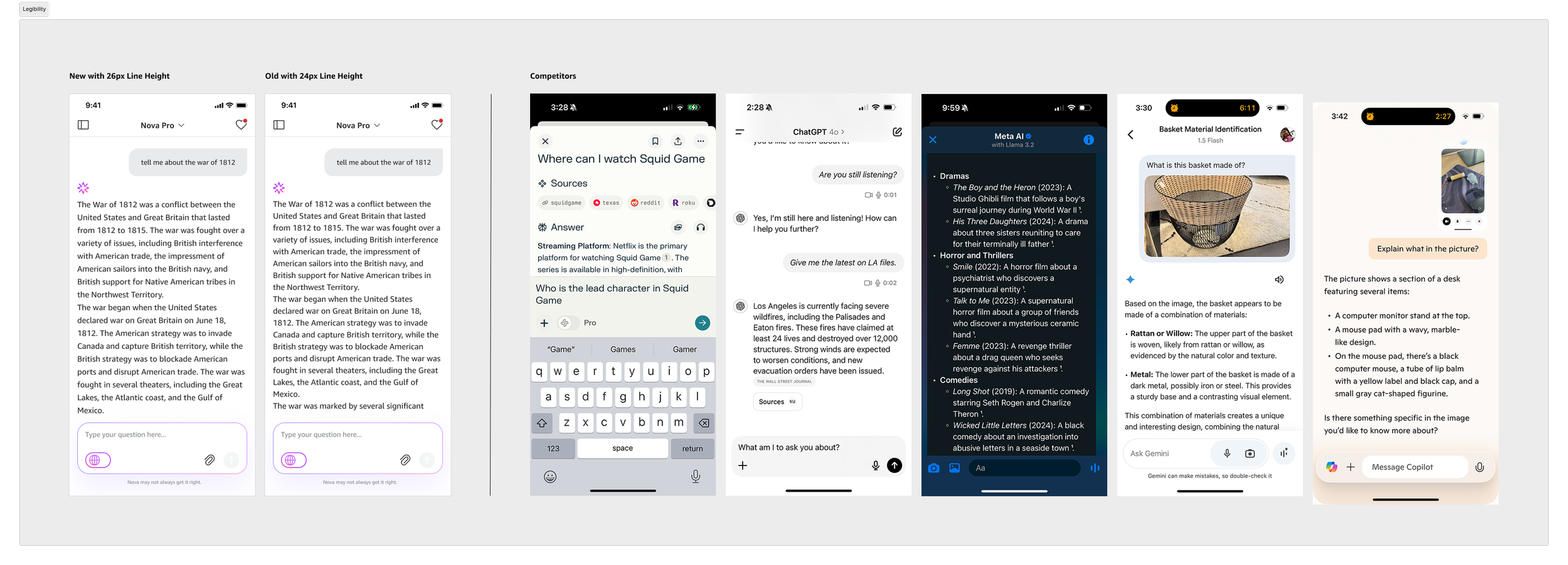
The transition from a "Hard line" to a Glass effect for the input bar enhances the interface's depth and modern aesthetic.
Reduced Visual Friction: Replacing the rigid border with a translucent, blurred background allows content to flow naturally behind the input area, creating a more integrated feel.
Refined Control Layout: The updated input bar consolidates actions—moving secondary tools like the attachment and grid icons to a dedicated row—to prioritize the "Submit" action and improve tap targets.
Intelligent Header Dynamics
The redesign introduces a dynamic header that prioritizes real estate for the conversation while maintaining easy access to navigation.
Maximizing Reading Space: The header now automatically hides as the user scrolls down, addressing the "Less space for response" pain point found in the previous iteration.
Contextual Awareness: The header intelligently reappears when a user scrolls back up, ensuring core navigation and model settings are always accessible when intent is shown.
Cleaner Hierarchy: By minimizing the top navigation during active reading, the interface focuses the user's attention entirely on the AI's response and complex code blocks.

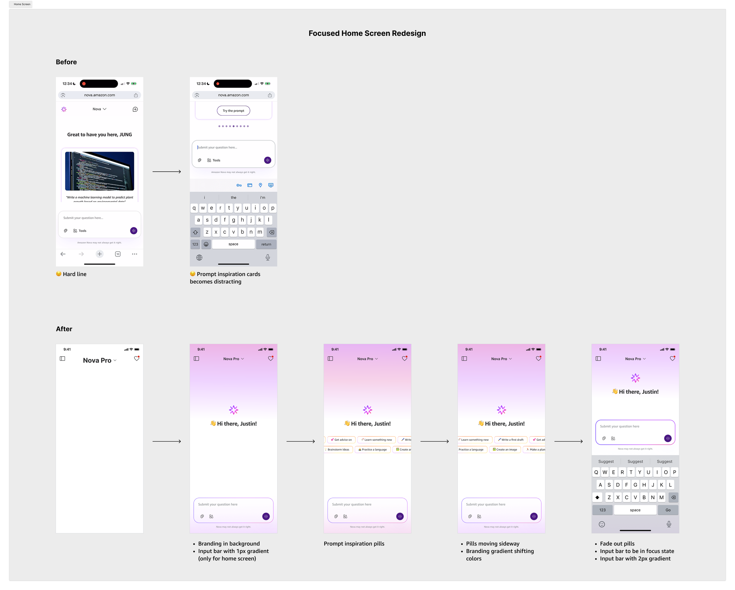
Focused Home Screen Redesign
The updated home screen replaces distracting elements with a clean, branded environment that guides users toward interaction.
Dynamic Branding: The design utilizes a branding gradient in the background that shifts colors, providing a premium feel without overwhelming the content.
Streamlined Inspiration: Large, distracting prompt inspiration cards were replaced with subtle "inspiration pills" that move sideways and fade out as the user focuses on the input bar.
Enhanced Focus States: The input bar utilizes a 1px to 2px gradient shift when in a focus state, clearly signaling the active area for the user to begin their query.
Component Refinements
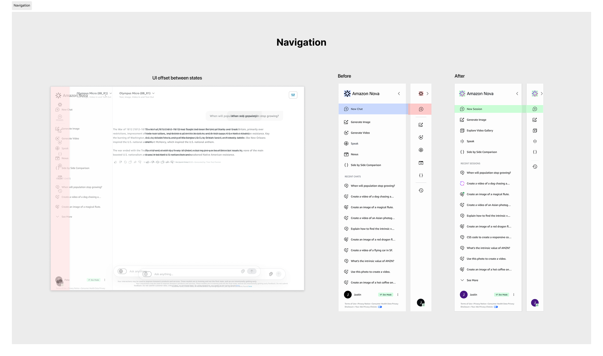
Polishing the edges of the design system by fixing layout inconsistencies and clarifying sharing context.
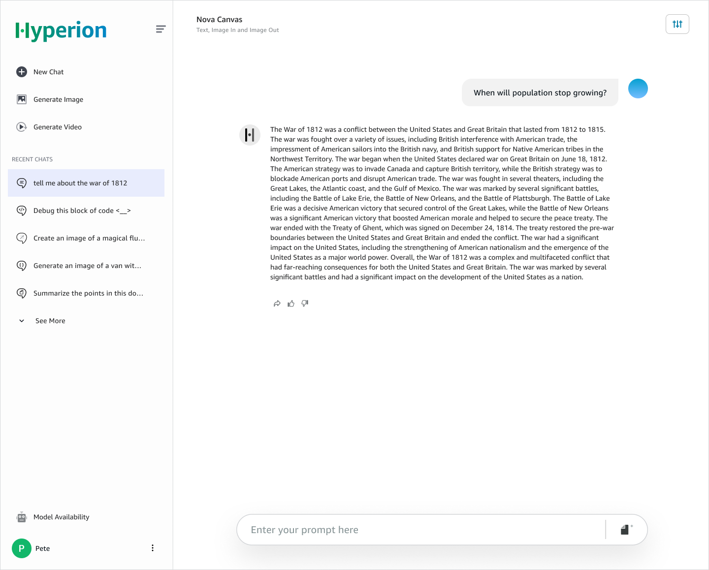
Navigation Realignment: I addressed the "UI offset" issues in the side navigation, ensuring pixel-perfect alignment between states. The icon hierarchy was refined, and the "New Session" affordance was strengthened to improve primary task completion.
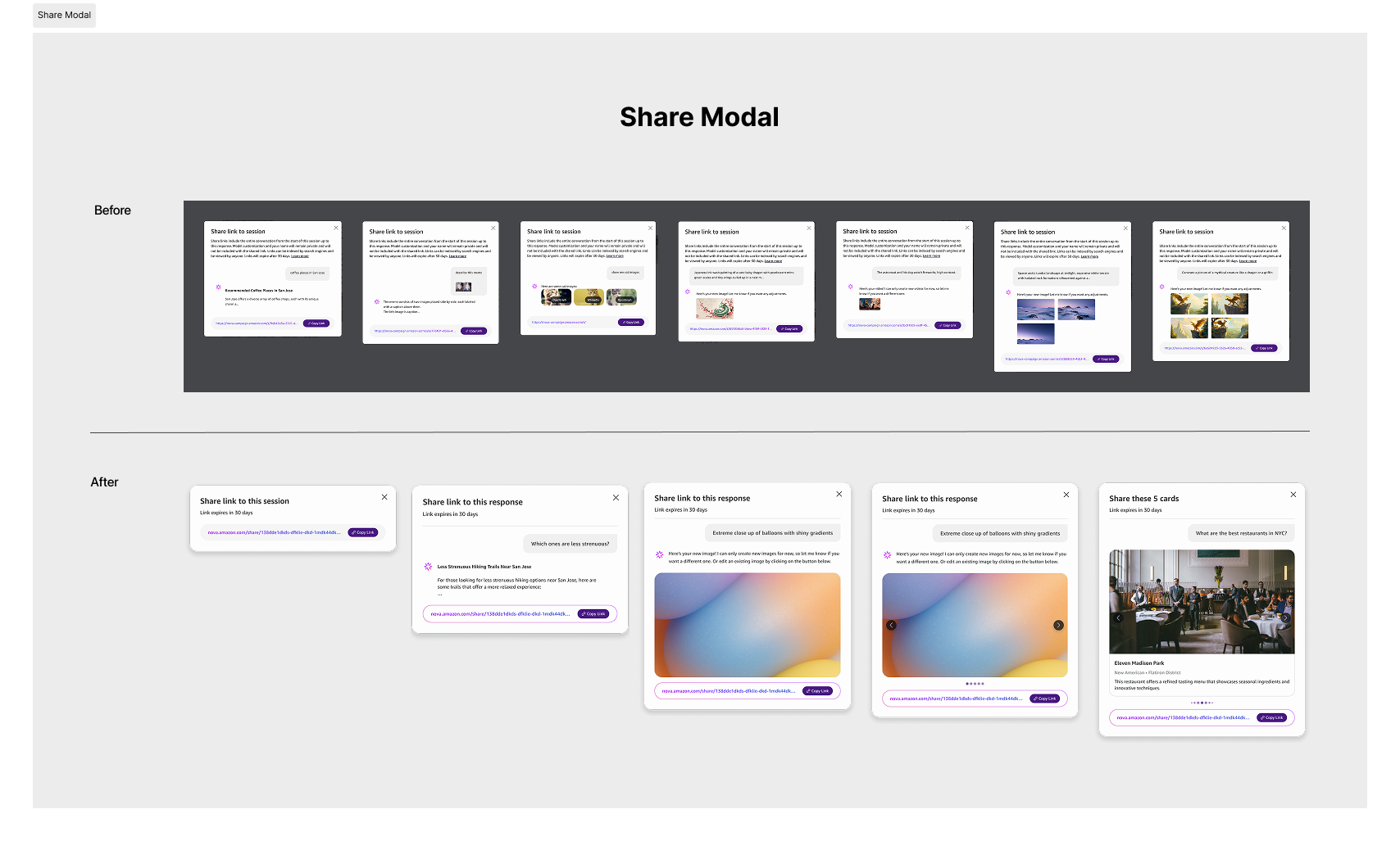
Context-Aware Sharing: The redesigned Share Modal moves away from a one-size-fits-all text block to context-specific cards. Whether sharing a full session, a single response, or specific image results, the UI now mirrors the shared content type for better user clarity.
Impact
What the system changed
Before it, three Nova sub-products were building their own components on their own schedules. After it, Gallery, Visual Response and Workspace launched on one library.
Handoff stopped requiring redline specs — tokens carried the values in both directions.
WCAG 2.1 AA contrast and touch targets shipped by default, regardless of the building team's accessibility expertise.
Light, dark and high-contrast came from one token swap instead of three sets of screens.
New response types plugged into validated containers rather than getting bespoke UI.
Velocity gains were real and team-reported. I didn't have instrumentation on design-to-ship time, so I'm not putting a number on it.
Lessons Learned
1. A design system is software, not a UI kit.
Treating design decisions as data — tokens with names, resolved through a hierarchy — is what let the system survive Nova adding output types nobody had planned for. A library of screens would not have.
2. Adoption is the only metric that matters.
I started as the reviewer and became the bottleneck within weeks. Moving to contribution guidelines and office hours meant giving up control over individual decisions to keep control of the architecture. That trade was correct and it took me too long to make it.
3. Interaction frameworks, not page layouts.
Standard web patterns break against variable AI output. What scales is logic that handles a range of data densities, not a layout that assumes one.
Future Horizon
As the Nova ecosystem evolves toward a mobile-first, "Agentic" future, the design system must transition from a static toolkit of components into a dynamic intelligence engine. The next phase of this architecture is designed to move beyond traditional UI patterns to support a world of ambient, autonomous computing.